
by Scott Katz | Mar 11, 2026 | Cannabis Branding
The cannabis industry has moved far past the familiar green-leaf icon. As legalization accelerates and more businesses enter the market, brands need a cannabis logo design that feels credible, modern, and easy to recognize. Consumers look for clarity and professionalism, especially on shelves where packaging space is tight, and state compliance rules limit what you can display.
A strong cannabis brand logo does more than look clean. It communicates identity, adapts to different packaging formats, and meets labeling rules that shift from one state to the next. In a saturated market, your logo becomes one of the most reliable ways to build trust and long-term recognition.
This guide explains what makes an effective, compliant cannabis logo, with clear steps and examples to help you develop branding that stands out for the right reasons.
Why Logo Strategy Matters in Today’s Cannabis Market
The cannabis industry now spans mature operators, craft producers, wellness-driven brands, luxury labels, and tech-forward retailers. As the market expands, branding trends are shifting away from gimmicky designs toward visuals more common in the beauty, wellness, lifestyle, and premium beverage sectors.
A strong logo influences:
- Perceived quality – A thoughtful cannabis logo can signal luxury, medicinal trustworthiness, artisanal craft, or lifestyle appeal, depending on your brand.
- Shelf presence – With many products vying for attention, a distinct logo helps your packaging catch a shopper’s eye on dispensary shelves.
- Retailer trust – Retail partners often give priority to brands that look professional and use consistent, clean branding. This can influence whether your product gets prime shelf placement or reorder priority.
- Scalability across products – As you add new lines (e.g., edibles, tinctures, topicals), a flexible logo/system ensures brand consistency across formats and keeps your identity recognizable.
- Regulatory and compliance readiness – Because cannabis packaging must include mandatory symbols, warnings, and THC/CBD disclosures, your logo must integrate into designs that leave space for required labeling.
Regulations, packaging requirements, and consumer expectations make generic or stereotypical branding risky. Without a strong logo strategy and clear brand identity, a company may blend in with dozens of competitors.
On the other hand, brands that invest in thoughtful logo design can build trust, differentiate themselves, and adapt across products and regulations. That often results in stronger consumer loyalty and better positioning long-term.

Common Cannabis Logo Clichés to Avoid
Before you create a strong cannabis company logo design, it helps to know which visuals can weaken your brand or limit how people see your products.
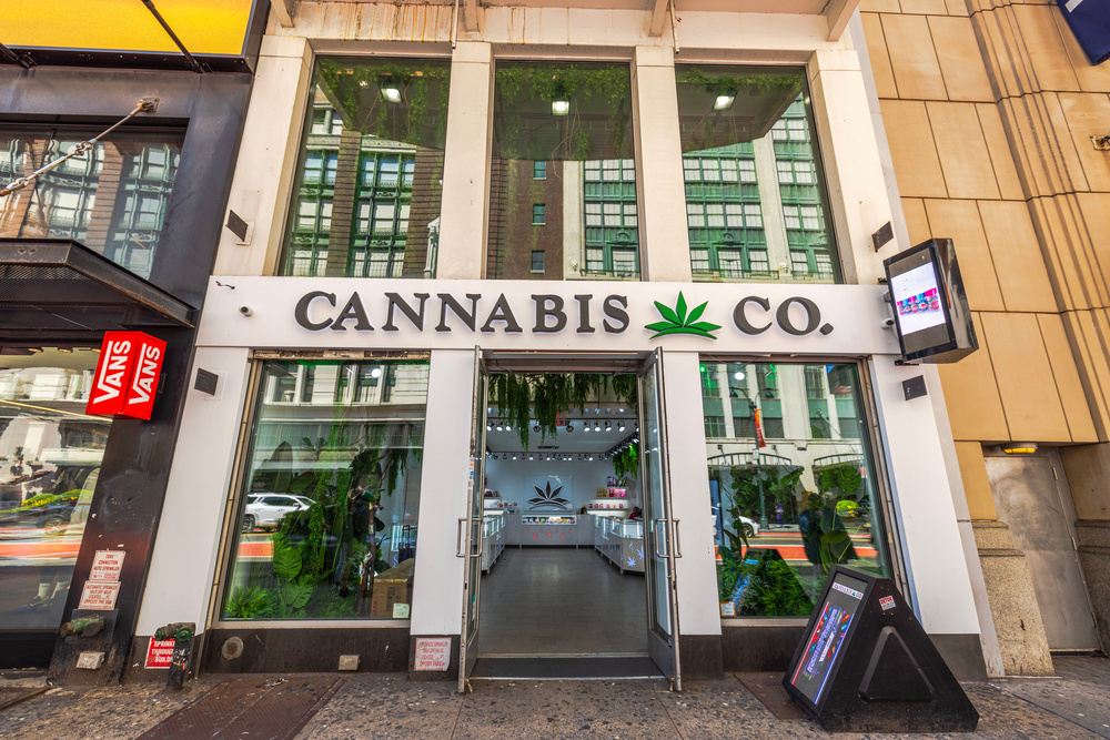
The Overused Cannabis Leaf
The leaf isn’t harmful on its own, but relying on it as the entire logo often signals a generic or low-effort identity. In wellness, medical, or luxury categories, it can reduce the sense of quality or professionalism. If you use the leaf, make sure it supports the design instead of becoming the whole concept.
Rasta/Green-Only Color Palettes
Green is still useful, but brands that limit themselves to only green tones blend into a crowded visual landscape. Color systems inspired by skincare, cosmetics, craft beverages, or boutique wellness brands help you stand out and reach broader audiences.
Cartoonish, Childlike Illustrations
Many states restrict any packaging that could appeal to children. Logos with bright, candy-like colors or cartoon mascots fall into that category and can put you at compliance risk. A clean, adult-focused style keeps you safer and presents your brand in a more credible way.
Icons like buds, smoke trails, bongs, or pipes can limit how far your brand can grow. They lock you into a narrow category and make it harder to expand into wellness, medical, or premium product lines. A more symbolic or abstract approach gives you room to evolve.
Five Design Principles for Strong Cannabis Logos
A strong cannabis logo design relies on timeless principles rather than short-lived trends. These fundamentals help your brand stay recognizable, compliant, and consistent as you expand.
1. Simplicity and Scalability
Your logo should stay clear and easy to identify, whether it appears on a billboard, a website header, a small vape pen label, or a compliance-heavy package. Simple marks reduce printing issues and keep your identity sharp at any size.
2. Distinctive Concepting
Instead of defaulting to leaf imagery, explore options such as abstract geometric shapes, symbols tied to your brand story, typography-driven marks, regional motifs, or minimalist monograms. Premium brands succeed because they think beyond the plant and build meaning into their visuals.
3. Legibility Across Packaging
Cannabis packaging must include:
- THC symbols
- Government warnings
- Batch numbers
- Potency details
- Ingredient lists
Your logo has to remain readable around these elements and maintain its strength even when scaled down.
A complete logo system often includes a primary lockup, a horizontal layout, a stacked version, a single-color option, and a small icon or favicon. These variations make your branding functional across social media, packaging, websites, merchandise, retail displays, and small-format print.
5. Emotionally Appropriate Tone
Different cannabis segments call for different aesthetics.
- Premium lifestyle – clean lines, neutral palettes, bold contrast, refined typography.
- Medicinal – structured fonts, wellness symbols, blues, and whites.
- Adventure/outdoors – earthy palettes, rugged textures, strong lettering.
- Fruity or edible brands – bright but mature tones with modern, compliant designs.
When your logo reflects the tone of your brand, it attracts the right audience and sets the right expectations from the first impression.
Compliance-First Design: What You Must Know
Compliance is where many cannabis logo designs run into problems. The issue usually isn’t the logo itself; it’s how the logo functions once it’s placed on packaging filled with required symbols, warnings, and testing details. A logo that can’t coexist with these elements becomes difficult or even impossible to use.
Most states require several items on every cannabis package, including:
- A universal cannabis or THC symbol
- THC/CBD potency
- Batch and testing details
- Mandatory health or safety warnings
- Child-resistant packaging notes
These elements influence where your logo can sit on the label and how much space it can reasonably take up.
Regulations in many states restrict imagery that could appeal to minors. This means avoiding:
- Cartoons or illustrated characters
- Mascots
- Candy-inspired visuals
- Youth-oriented colors or shapes
- Immitations of well-known non-cannabis brands
If your logo leans even slightly playful or resembles mainstream snack branding, regulators may flag it.
Some states also set rules for how design elements appear on packaging, such as:
- Minimum contrast ratios
- Minimum spacing around the universal cannabis symbol
- No overlapping or crowding the THC badge
- No covering mandatory language
Your logo has to adapt to these constraints, not overpower the legal elements on the label.
Practical Compliance Design Tips
DO:
- Leave generous clear space around required symbols
- Use high contrast for small text
- Provide a clean, single-color version for packaging engineers
DON’T:
- Force the logo into tight corners
- Use thin lines that disappear when printed at small sizes
- Use gradients that cause printing inconsistencies on child-resistant bags
Compliance isn’t a restriction; it’s a chance to show consistency, clarity, and professionalism across every product you release.
The strongest cannabis logos are designed with packaging in mind from day one. Here’s how different types of brands translate their identity into marks that remain compliant, readable, and premium across real-world formats.
Premium Minimalist Brands
Luxury cannabis brands often rely on subtlety and restraint. Their logos typically feature:
- Refined, high-end typography
- Clean monograms or symbolic initials
- Black, gold, white, or muted earth tones
- Minimalistic line work or abstract motifs
These designs excel on matte pouches, frosted glass jars, foil-stamped boxes, and other premium materials where simplicity amplifies sophistication.
Medicinal/Wellness Brands
Medical and wellness-focused companies prioritize trust and clarity. Their logos often include:
- Clean sans-serif fonts for clinical readability
- Blue, white, green, or calming tonal palettes
- Wellness-inspired geometric shapes or cross-like symbols
This style helps reinforce safety, legitimacy, and purpose, especially important in markets where medical credibility is essential.
Craft growers and heritage-focused brands use design to communicate authenticity and tradition. Their logo styles frequently include:
- Rustic or nature-inspired color palettes
- Heritage or vintage-style typography
- Iconic badges, seals, or crest-like structures
- Regional cues or natural motifs
These marks tend to feel established, story-driven, and rooted in culture, making them ideal for brands built around legacy or locality.
How to Create and Test a Compliance-Friendly Cannabis Logo
Creating a cannabis logo that looks great and passes compliance checks isn’t luck; it’s a structured process. Here’s a step-by-step workflow used by top cannabis designers and brand teams.
Step 1: Research Your Market
Start by mapping the landscape:
- State regulations (THC icons, font sizes, warning language, color limitations)
- Competitor visual trends (minimalist, medical, craft, luxury, lifestyle)
- Retail shelf layouts (what actually stands out in dispensaries)
This gives you the blueprint for differentiation without violating rules.
Step 2: Build Concept Boards
Moodboards clarify direction early in the process. Collect examples of:
- Typography styles
- Color palettes
- Symbol ideas
- Competitive logos
- Packaging examples
This prevents guesswork and aligns stakeholders before design begins.
Step 3: Sketch and Iterate
Start rough. Create multiple symbol, lettering, and composition ideas. Prioritize simplicity, scalability, and clarity. The three traits that consistently survive compliance review.
Step 4: Vectorize and Build Variants
Once your strongest concepts emerge, develop digital versions and create essential logo variants:
- Full-color
- Monochrome
- Reverse (white or dark)
- Standalone icon or badge
- Horizontal and stacked versions
Flexibility is crucial since cannabis packaging varies widely in size and orientation.
Step 5: Packaging Mockups
Before finalizing, test your logo across the formats you’ll actually use:
- Mylar bags
- Glass jars
- Concentrate containers
- Vape carts
- Pre-roll tubes
- Shipper boxes and display trays
Mockups reveal issues like cramped spacing, unreadable small text, or color conflicts with warning panels.
Step 6: Compliance Review
Run the logo through a compliance filter:
- THC warning placement
- Required icons
- Minimum type sizes
- Child-appeal restrictions
- Contrast ratios
- Local retailer or distributor guidelines
Catching problems now prevents costly redesigns after thousands of labels are printed.
Step 7: Finalize Brand Guidelines
Wrap the process by creating a brand guideline package that includes:
- Logo versions and spacing rules
- Approved colors
- Typography choices
- Packaging do’s and don’ts
- Placement rules for warnings and THC symbols
- Examples of correct and incorrect usage
This ensures printers, designers, partners, and future team members maintain consistency.
Essential Logo Assets Every Cannabis Brand Should Have
A strong cannabis logo design isn’t just the main mark. It comes with a suite of assets that keep your branding consistent, readable, and compliant across all applications. Every cannabis brand should prepare:
- AI/PDF master vector files for scalable, high-resolution use
- Horizontal and vertical variants to fit different layouts
- Single-color and reversed versions for flexible printing and digital use
- Clear-space rules to maintain logo visibility
- Packaging-safe color palette that works with mandatory icons and warnings
- Icon or symbol mark for small-format use like labels, social media, or favicons
- Compliance overview page for packaging and design teams
Having these assets ready saves design and production teams hours, prevents mistakes, and protects your brand’s professional appearance on every product and marketing channel.
Cannabis logo design is no longer just about showing what you sell. It’s about communicating who you are, building trust, and navigating one of the most regulated packaging environments in consumer goods.
A strong cannabis logo stands out without relying on clichés, scales cleanly across packaging types, and remains compliant with state-specific rules. When done right, it becomes the cornerstone of a brand that grows, adapts, and thrives in a competitive market.
Ready to elevate your brand with a compliant, standout logo? Custom 420 Supply’s in-house design team specializes in cannabis logo design that balances creativity, compliance, and market impact. Contact us today to create a logo that builds trust, supports your products, and positions your brand for long-term success.
Frequently Asked Questions
What elements should you include when designing a cannabis logo?
A strong cannabis logo typically includes a clear, recognizable mark, typography that reflects your brand personality, and a color palette that aligns with your category (premium, medicinal, craft, or lifestyle). You should also prepare logo variants (horizontal, vertical, single-color, reversed) and establish clear-space and minimum-size guidelines to ensure readability across packaging, digital, and retail formats.
How do regulatory and compliance factors influence cannabis logo design?
State regulations affect what imagery, colors, and text can appear on cannabis packaging. Your logo must work alongside mandatory elements like THC symbols, health warnings, and potency information. Compliance also means avoiding child-appealing graphics, cartoons, or candy-inspired visuals. Designing with these rules in mind ensures your logo remains usable, legally safe, and professional across all products.
What are the latest logo design trends for cannabis brands?
Modern cannabis logos are moving away from overused leaf imagery and stereotypical visuals. Current trends include minimalist typography, abstract geometric marks, wellness-inspired symbols, monograms, and earthy or premium color palettes. Brands are also prioritizing versatility, ensuring logos work across small packaging, social media, and large-format displays while maintaining a professional, compliant look.
by Scott Katz | Feb 25, 2026 | Cannabis Branding
Cannabis brand fonts play a direct role in how quickly people recognize and trust your products, especially in a market that grows more competitive every year. Brands are fighting for attention on dispensary shelves, online stores, and social feeds, and typography is one of the fastest ways to communicate who you are.
The right fonts help customers understand your personality at a glance, shape how “premium” or approachable your products feel, and build the kind of familiarity that brings people back.
In this guide, we’ll walk through how typography shapes brand identity, what different font families signal to consumers, how to choose pairings that support your identity, and how to stay compliant and accessible in a regulated industry.
Why Typography Matters for Cannabis Brands
Typography is one of the first cues consumers use to read your brand. At a glance, fonts show whether you’re premium or fun, medical or lifestyle-focused, minimalist or artisanal. Clear typography improves perceived quality, enhances readability, and supports the trustworthiness of your packaging.
In the cannabis industry, where label rules vary by state, typography also performs a crucial legal role. Required details (like dosage, warnings, ingredients, potency, and regulatory symbols) must remain readable even at small sizes. For example, some regions mandate a minimum label font size (often no smaller than 6-point) to ensure compliance.
That means the best fonts for cannabis branding need to balance style, clarity, and regulatory compliance at the same time.
Typography is Your Brand Voice: What Fonts Communicate
Typography in cannabis branding works the same way your verbal tone does. Each font category sends emotional signals that shape how people interpret your products before they read a single line. Here’s a clear breakdown of what each style communicates and when it works best.
Vibe: heritage, artisanal, premium, trustworthy
Best for: craft flower brands, CBD wellness lines, medical-leaning products
Serif fonts add a sense of history and care. Their small strokes and details create a feeling of quality, which helps customers associate your brand with consistency and reliability.
Vibe: modern, clean, transparent, tech-forward
Best for: recreational brands, contemporary edibles, vaporizer, and device companies
Sans-serifs feel open and straightforward. They’re a strong fit for brands that want to appear honest, friendly, or youth-oriented. These fonts often scale well in digital environments, which is helpful for e-commerce and mobile menus.
Vibe: expressive, handcrafted, bold
Best for: logos, headers, small-batch microbrands, legacy or counterculture lines
Display and script fonts create a strong personality fast, but they lose clarity if used for long text or compliance details. Keep them in headline roles where you need energy or a crafted feel without risking readability.
Geometric, Monospaced, or Technical Fonts
Vibe: clinical, scientific, precise
Best for: medical cannabis brands, lab-driven companies, product lines emphasizing purity and testing
These font styles signal structure and accuracy. They’re often associated with science, which helps reinforce credibility for brands focused on lab testing, extraction, or pharmaceutical-style product lines.
Readability and Legibility: The Non-Negotiables
Before you focus on creative flair, clarity must come first.
- Regulatory text on cannabis packages must meet minimum size standards. For example, in many jurisdictions required label text must use a “typed, legible font… at least 1/16th of an inch in height” (measured on an uppercase letter) to be compliant.
- Consumers depend on easily readable dosage, warning, and ingredient information to use products safely. If fonts are too small or decorative, it can create confusion or even legal risk.
- On a crowded dispensary shelf, clear, legible labels help products stand out and be recognized quickly.
Best Practices For Legibility:
- Use simple sans-serif fonts (like Inter, Roboto, or Helvetica-style faces) for body text or regulatory information. These tend to stay readable even at small sizes.
- Keep strong contrast between text and background, avoiding light gray text on colorful or patterned backgrounds. A high contrast assures readability under various lighting.
- Maintain generous spacing: appropriate line height (for example, 120–150% of the font size) and enough padding around text blocks improve readability and reduce visual clutter.
- Test every font at actual packaging size. A typeface might look clear on a large screen or billboard, but become unreadable on a small container, vape pen, or edible pouch. Many label-source guides recommend real-world testing for size, contrast, and durability.
If your font looks crisp on a poster but scrunched on a 1-inch label (especially under low or bright dispensary lighting) it’s not the right choice.
Font Categories and When to Use Them (With Cannabis Examples)
Choosing the right font category helps your cannabis brand stay clear, memorable, and emotionally consistent. Here’s how each type functions and when it’s most effective.
Use serif fonts when you want to communicate premium, earthy, timeless, or medicinal qualities. They’re a strong fit for craft-grown flower lines and therapeutic cannabidiol (CBD) products. A tall, elegant serif on a tincture label signals trust, care, and a grounded brand personality.
Modern cannabis brands (especially those in edibles, beverages, wellness, or tech-driven products) often lean on clean sans-serifs. These fonts stay readable at small sizes, scale well across formats, and support a friendly, transparent tone.
Display and script styles work well for brand names, logos, or standout elements on packaging. They’re popular among microbrands and legacy-inspired lines that want a bold, expressive, or retro energy. The key is balance: they belong in headlines, not in dosage or compliance text.
Handwritten and Retro Fonts
These fonts can support brands that tap into nostalgia, 70s-style visuals, or classic “stoner culture” cues. They add warmth and personality, but should stay limited to accents. Heavy use can make a brand feel unclear or inconsistent.
Custom and Variable Fonts
Some cannabis companies invest in custom typefaces to build a distinct visual identity. Variable fonts are especially useful because their flexible weight and width settings allow consistent readability across packaging sizes, websites, and digital menus without losing clarity.
Practical Font Pairings for Cannabis Brands
Smart font pairing helps your packaging stay expressive while still meeting compliance and readability needs. Here are reliable combinations that work well across cannabis categories.
Headline: DM Serif Display
Body: Inter
Why it works: This blend offers an elevated serif voice with clean, modern readability. It’s ideal for premium flower, tinctures, and wellness-forward lines that want to feel refined without looking old-fashioned.
Headline: Montserrat
Body: Roboto
Why it works: Both fonts are approachable, youthful, and strong on digital screens. This duo is great for recreational brands, edibles, infused drinks, or lifestyle-driven products.
Headline: Helvetica Neue or a similar geometric sans
Body: Open Sans
Why it works: These fonts remain highly legible at small sizes and project trust, safety, and professionalism; crucial traits for medical cannabis brands and lab-forward companies.
Headline: Playfair Display
Body: Lora or Georgia
Why it works: These pairings evoke artisanal quality and organic roots. They fit well with small-batch flower lines, farm-grown brands, and premium CBD products.
5. Legacy / Counterculture
Headline: Custom display font
Body: A simple sans-serif
Why it works: You get a bold personality up top while keeping compliance text clean and easy to read. This combo protects legibility without losing the rebellious energy of legacy or counterculture brands.
Web and Digital Considerations
A font that works well on packaging won’t always behave the same way on your website or mobile shop. Digital environments add new requirements that influence clarity, load time, and accessibility. Here’s what to prioritize when choosing cannabis brand fonts for online use.
- Use variable fonts to improve performance. They reduce file requests and help pages load faster, especially on mobile.
- Choose web fonts with broad browser support. This prevents layout shifts or fallback fonts that can weaken your brand identity.
- Build a scalable type system. Make sure headlines, body text, and dosage numbers stay readable on small screens.
- Check numeric clarity. Dosage values and product strengths must be unmistakable at any size.
- Follow WCAG contrast standards. High contrast improves accessibility and supports customers who rely on screen readers or low-vision settings.
Your digital typography should stay consistent with your packaging type choices. This creates a unified identity across e-commerce, social platforms, and physical products.
Licensing, Trademarks, and Legal Checklist
Typography choices aren’t purely creative decisions; they also carry legal and operational weight. Using the wrong font can delay packaging approvals or create trademark issues later. Here’s what to verify before finalizing any cannabis brand fonts.
- Confirm commercial licensing for every use case, including packaging, web, digital ads, print materials, and merchandise.
- Avoid fonts labeled “free for personal use.” These are not permitted for commercial branding and can lead to legal disputes.
- Store all license files and receipts in your brand asset folder so your team can access them during audits or redesigns.
- Check whether your logo font allows derivative works. Some licenses restrict modification, which can impact logo design or custom wordmarks.
- For custom typefaces, document ownership and rights in writing. This ensures you control the font long-term and can use it across future product lines.
Packaging and Regulatory Constraints
In regulated markets, your typography choices must meet more than style goals. Label design must satisfy state rules, and that includes how text, symbols, and warnings appear. No matter how creative your cannabis brand fonts are, packaging must stay compliant.
What the Rules Typically Require
- In many places, required warnings must be printed in at least 6-point font (or equivalent legibility) and be clearly visible.
- Required symbols (such as the universal cannabis/THC symbol or child-safety icons) must be present, clearly visible, and of a minimum size.
- Text and symbols must stand out with good contrast and unobscured placement to ensure readability and regulatory compliance.
- Many states forbid overly decorative or misleading typography on regulated labels (especially for medical or edible products). Labels must not use designs that could appeal to minors or obscure mandatory information.
- Build a clear typographic hierarchy: e.g., brand name → strain or product name → dosage/THC content → required warnings and symbols. This order helps make sure compliance info is legible and prioritized.
- Use a “compliance typeface,” such as a plain, highly legible font (serif or sans-serif) for warnings, dosage, and regulatory data. That keeps the required information separate from decorative branding elements.
- Always mock up packaging at true size before printing. A font that looks fine on screen might be too small, blurry, or illegible on a real package.
- Avoid blending decorative/expressive fonts with critical info. Decorative fonts can harm legibility and may run afoul of state regulations if warnings or symbols are obscured.
Typography isn’t just decoration; it’s your brand’s personality, voice, and first impression.
The right cannabis brand fonts can elevate your identity, build trust, enhance compliance, and help your products stand out in an increasingly saturated market. By pairing expressive, on-brand type choices with legible, compliance-focused typography, you’ll build a design system that looks great, performs even better, and helps your customers feel confident choosing your products.
Need help getting it right?
At Custom 420 Supply, our in-house design team specializes in creating compliant, premium cannabis labels that meet state regulations and elevate your brand. Whether you need a full typography system, a refreshed wordmark, or packaging-ready label files, we ensure every detail is both beautifully crafted and fully compliant. Contact us today!
Frequently Asked Questions
How do you choose typography that reflects a cannabis brand’s personality?
Choose typography based on the tone and emotion you want your brand to communicate. Modern sans-serifs work well for clean, wellness-focused brands, while bold serifs or display fonts can signal heritage, luxury, or creativity. Look for fonts that match your brand values, speak to your target audience, and stay readable across packaging, digital, and print.
Which font styles help a cannabis product stand out on-shelf?
High-contrast serif fonts, modern geometric sans-serifs, and custom display fonts can help cannabis products stand out. Pair an expressive headline font with a clean, readable body font. Strong hierarchy, consistent spacing, and clear labeling also make your packaging more eye-catching and easier for shoppers to navigate.
What are the legal and readability considerations when selecting fonts for cannabis packaging?
Cannabis packaging must meet state-specific rules for minimum font sizes, contrast, warnings, and legibility. Avoid overly decorative or hard-to-read fonts for required information. Use a clear compliance typeface for warnings and drug facts, ensure symbols and labels meet size requirements, and verify that all fonts have proper commercial licensing for packaging use.
by Scott Katz | Feb 13, 2026 | Cannabis Packaging Law State Guides
Maryland cannabis packaging regulations govern one of the most scrutinized aspects of the state’s legal cannabis market. Whether you’re a cultivator, processor, manufacturer, or dispensary, failing to meet these requirements can result in product seizures, fines, or even license suspension.
This guide breaks down everything Maryland requires for cannabis packaging and labeling. You’ll learn about child-resistant standards, edible-specific rules, prohibited designs, and enforcement practices, so you can stay compliant and protect your business.
Maryland’s Cannabis Packaging Regulatory Framework
The Maryland Cannabis Administration (MCA) regulates cannabis packaging in Maryland, with enforcement support from the Alcoholic Beverages and Cannabis Commission (ATCC). The primary legal authority comes from:
- COMAR 14.17.18 – Cannabis Packaging, Labeling, and Advertising: This regulation outlines specific requirements for child-resistant packaging, required label information, prohibited marketing claims, and advertising restrictions for all cannabis products.
- Title 36 of the Alcoholic Beverages and Cannabis Article: This statute establishes the legal framework for cannabis operations in Maryland, including licensing requirements, operational standards, and penalties for non-compliance.
These regulations apply to all adult-use and medical cannabis products sold in the state. They prioritize consumer safety, prevent youth exposure, and ensure transparency.
General Cannabis Packaging Requirements
All cannabis products sold in Maryland must meet baseline packaging standards, regardless of product type. Here’s what you need to know.
Child-Resistant Packaging
Cannabis products must use child-resistant containers that meet federal standards under 16 C.F.R. §1700.15. Maryland cannabis packaging regulations require containers that:
- Are difficult for children under five to open
- Can be reasonably opened by adults
- Remain child-resistant after multiple openings (if resealable)
This requirement applies to all finished cannabis products, including flower, concentrates, edibles, and topicals.
Maryland requires cannabis packaging to be tamper-evident. The package must clearly show if it’s been opened or altered before purchase. Acceptable features include:
- Heat seals
- Breakable tabs
- Security stickers or bands
If the tamper-evident feature is compromised, the product may be deemed non-compliant and subject to removal from sale.
Opaque and Plain Packaging
Cannabis packaging must be fully opaque. You can’t use transparent windows or cutouts that reveal the product inside. Additionally, packaging must be plain: free from excessive decoration or promotional imagery that could attract minors.
Resealable Packaging for Multi-Serving Products
Any cannabis product containing multiple servings must use a resealable, child-resistant container. The container must maintain its safety features after opening.
Cannabis Labeling Requirements
In addition to packaging standards, Maryland cannabis packaging regulations require detailed labeling disclosures. These labels ensure consumer awareness and product traceability.
Each cannabis product must include:
- Product name
- Finished product lot number
- Expiration date (if applicable)
- Name, address, and phone number of the dispensary
- Universal cannabis symbol clearly displayed
- Government warning statements, including:
- “This product contains cannabis”
- Impairment and operating machinery warnings
- Pregnancy and breastfeeding warnings
- “Keep out of reach of children”
Labels must also disclose:
- Total tetrahydrocannabinol (THC) and cannabidiol (CBD) content in milligrams
- A breakdown of cannabinoids and terpenes, where applicable
- All non-cannabis ingredients, listed clearly and accurately
Misrepresenting potency or ingredients is a serious compliance violation. The MCA can issue fines, order product recalls, or suspend licenses for inaccurate labeling.
Edible Cannabis Packaging Requirements in Maryland
Edible cannabis products face additional restrictions due to ingestion risks and their potential appeal to minors.
Maryland caps edible cannabis products at:
- 10mg THC per serving
- 100mg THC per package
Each serving must be clearly defined and labeled. This means products containing multiple servings need visible score marks, perforations, or individual wrapping to distinguish each 10 mg dose.
Edible labels must also include a warning stating:
“The intoxicating effects of this product may be delayed.”
This warning must be prominent and easy to read.
Furthermore, edible packaging must disclose:
- Ingredient lists in descending order by weight
- Allergen information (when applicable)
- Nutritional information, which may be provided via:
- A traditional nutrition panel, or
- A QR code linking to the required information
QR codes offer flexibility for smaller packages where space is limited, but the information must remain accessible and accurate.
Prohibited Cannabis Packaging and Labeling in Maryland
Maryland strictly prohibits packaging designs that could mislead consumers or appeal to underage individuals.
Cannabis packaging may not include:
- Cartoons, mascots, or animated characters
- Candy-like imagery or branding
- Neon colors or designs resembling non-cannabis consumer products
- Any imagery or language that targets or appeals to minors
These restrictions apply to all product categories, including edibles that might otherwise use playful branding common in the food industry.
Furthermore, packaging must not:
- Suggest government approval or endorsement
- Imitate official seals or insignias
- Make false health or therapeutic claims
- Misrepresent potency, effects, or contents
Even truthful health statements can trigger violations if they’re not supported by FDA-approved research or imply medical benefits beyond what’s legally permitted. When in doubt, stick to factual cannabinoid content and avoid wellness language.
Packaging Rules for Cannabis Seeds and Home Cultivation Products
Cannabis seeds sold in Maryland must comply with separate packaging standards, including:
- Secure, dry packaging that prevents premature germination
- Clear labeling of:
- Licensee name
- Seed count or weight
- “For use by adults 21 and over” warning
These requirements ensure seeds remain viable until the consumer is ready to cultivate and prevent accidental exposure to minors who might mistake them for food or novelty items.
Enforcement and Penalties for Non-Compliance
The MCA and ATCC have the authority to inspect cannabis products and enforce packaging rules. Violations of Maryland cannabis packaging regulations may result in:
- Product recalls or seizures
- Civil penalties and fines
- License suspension or revocation
- Criminal penalties for egregious or repeated violations
Packaging compliance isn’t optional; it’s a foundational requirement for operating legally in Maryland’s cannabis market. Regular internal audits and staff training can help you catch issues before regulators do, protecting both your license and your revenue.
Best Practices for Staying Compliant
To reduce risk and streamline approvals:
- Use pre-certified child-resistant containers
- Work with packaging vendors experienced in Maryland compliance
- Conduct internal label audits before product launches
- Monitor COMAR updates and MCA guidance regularly
- When in doubt, consult compliance counsel before printing packaging
Building these practices into your standard operating procedures saves time and money by preventing costly redesigns, product holds, and regulatory delays.
Maryland cannabis packaging regulations protect consumers while holding operators to clear, enforceable standards. By understanding and implementing these requirements (from child-resistant packaging to edible-specific labeling), you can avoid costly compliance issues and build trust with both regulators and customers.
Staying compliant doesn’t have to be complicated. Custom 420 Supply offers packaging and labeling services specifically designed for cannabis brands operating in Maryland. We ensure your products meet 100% of the state’s requirements, so you can focus on growing your business instead of worrying about regulatory details.
Contact us today to learn how we can simplify your compliance process.
Frequently Asked Questions
Do Maryland cannabis packaging regulations apply to medical and adult-use products?
Yes, Maryland cannabis packaging regulations apply to both medical and adult-use cannabis products. All licensed operators must follow the same packaging and labeling standards, regardless of the product’s intended market.
Can Maryland cannabis packaging include QR codes?
Yes, Maryland allows QR codes on cannabis packaging, provided they link to compliant information such as certificates of analysis, nutritional details for edibles, or additional product disclosures. QR codes may not link to prohibited advertising or misleading claims.
Are custom cannabis packaging designs allowed in Maryland?
Custom cannabis packaging designs are permitted in Maryland as long as they meet all regulatory requirements. Designs must remain opaque, avoid imagery appealing to minors, and include all required warning statements and symbols.
Do Maryland cannabis packaging regulations change often?
Maryland cannabis packaging regulations can change as the market evolves and agencies update compliance standards. Licensed operators are encouraged to monitor COMAR updates and guidance from the Maryland Cannabis Administration regularly.
by Scott Katz | Oct 13, 2025 | Custom Cannabis Labels
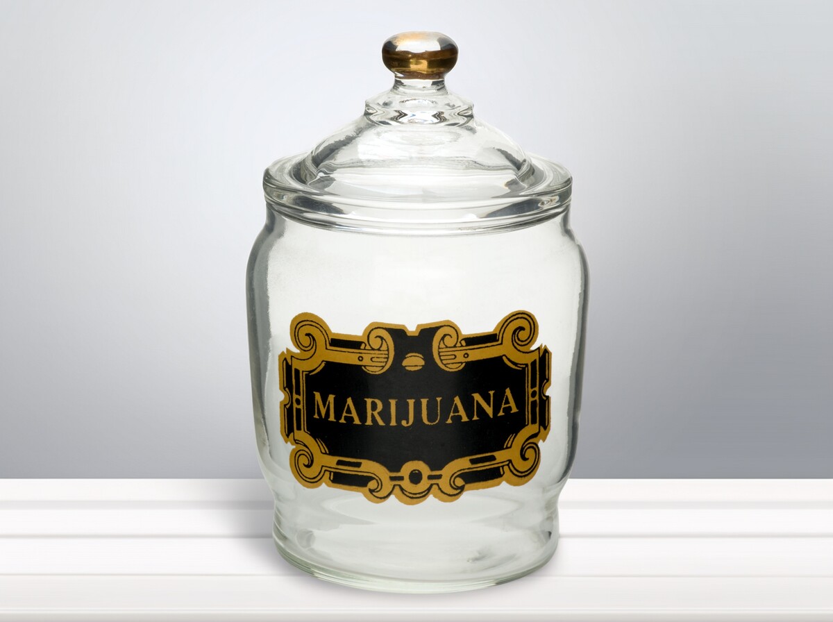
Cannabis packaging has changed a lot over the past century. Today, brands use sleek glass jars, bold graphics, and QR-coded labels to attract customers. Before this modern approach, cannabis was sold in hand-crafted jars featuring antique marijuana ad jar labels.
These labels caught the eye, built trust, and reflected the brand’s identity. Beyond nostalgia, these historic designs offer valuable inspiration for today’s cannabis businesses looking to stand out in a competitive market.
The History of Antique Marijuana Jar Labels
At the turn of the 20th century, cannabis was mostly sold as a medicinal product. Apothecaries and early retailers used decorative labels to convey professionalism and quality.
These labels often featured detailed illustrations, elegant typography, and vibrant colors, helping to establish trust and authenticity. They were more than just packaging; they created the brand’s first impression.
Early designs included botanical drawings of the cannabis plant, hand-lettered brand names, and claims of medicinal benefits. Labels were made from paper glued directly to jars or embossed tin lids with colorful decals.
While they feel vintage today, their purpose was the same as modern cannabis packaging: building consumer trust and brand recognition.
Key Design Elements of Antique Labels
Examining antique marijuana ad jar labels highlights several recurring design elements:
- Typography – Bold, decorative fonts that emphasized the brand name.
- Illustrations – Botanical drawings or ornate borders that made the product visually striking.
- Colors – Rich, contrasting colors to improve visibility and memorability.
- Materials – Paper, tin, or glass-based labels designed to withstand storage and shipping.
These choices were deliberate, communicating quality and reliability to consumers. Today, cannabis brands can draw inspiration from these elements to create packaging that feels artisanal, premium, or nostalgic, while meeting modern safety and compliance standards.
Lessons for Modern Cannabis Packaging
What can today’s cannabis businesses learn from antique labels? Here are key takeaways:
- Make Your Brand Memorable – Use bold visuals and clear branding to stand out on shelves, just like vintage labels did.
- Tell a Story – Include elements that reflect your brand’s history, values, or craftsmanship. Authenticity resonates with consumers.
- Combine Style with Compliance – Antique labels prioritized aesthetics, but modern packaging must also meet legal standards. Smart design balances both.
- Use Premium Materials – High-quality jars and labels elevate perceived value, echoing the care seen in historic packaging.
By applying these lessons alongside modern branding trends, cannabis businesses can create packaging that attracts attention, builds trust, and drives sales.
Custom Label Solutions for Cannabis Businesses
Modern cannabis brands don’t need to recreate antique designs from scratch. Custom jar labels let businesses integrate vintage-inspired aesthetics while ensuring durability, accurate color reproduction, and compliance with state regulations.
Options like full-color wraps, embossed decals, or matte-finish designs allow brands to honor the artistry of historic labels while meeting today’s business and legal requirements.
Final Word
Antique marijuana ad jar labels offer more than a glimpse into cannabis history; they provide a roadmap for innovative, eye-catching packaging today. By learning from these vintage designs and investing in high-quality, custom labeling, cannabis brands can create products that are both visually striking and commercially effective.
Do you want to add a vintage spin to your product and aren’t sure where to begin? Why not get customized antique labels for your marijuana packaging? Custom 420 Supply can help you create this design while ensuring all labels are compliant with your state.
Want to learn more? We invite you to reach out through our contact page today!

by Scott Katz | Jul 30, 2025 | Cannabis Jars, Cannabis Labels
When it comes to premium cannabis concentrates like rosin, quality matters. However, presentation seals the deal. And in an increasingly competitive extract market, rosin jar labels have emerged as a powerful tool for building brand identity, boosting shelf appeal, and meeting regulatory standards.
Whether you’re a boutique hashmaker or an established brand looking to elevate your packaging, dialing in your labels is essential. In this guide, we’ll walk you through everything you need to know to brand your concentrates like a pro.
What are Rosin Jar Labels?
Rosin jar labels are adhesive labels that fit concentrate containers, usually glass jars. These labels serve both branding and compliance purposes. Common types include:
- Side-wrap labels that go around the jar for easy branding.
- Lid-top stickers that show strain names or product type at a glance.
- Tamper-evident seals that show if the jar has been opened.
- Bottom or base labels that list batch numbers, weight, and lab test results.
Using the right mix of these rosin label jars makes your product look more professional, helps buyers find information quickly, and builds trust with your customers. It also supports compliance with industry packaging rules.
The Business Case for Branded Rosin Packaging
In cannabis sales, how your product looks matters. Branded rosin packaging is often the first thing a customer sees, and it can be the reason they choose your product over another. A clear, strong label builds trust fast. It also encourages people to share photos online and helps them remember your brand for future purchases.
Still, good packaging does more than look nice. It helps you meet dispensary label requirements and keeps your business in line with regulations. Labels should clearly show cannabinoid content, terpene details, and required disclaimers. This keeps your product compliant and gives customers the information they need to buy with confidence.
Label Styles and Why They Matter
Different types of rosin jar labels serve different purposes. Using more than one label can help you keep your design clean while sharing all the details customers and regulators need.
- Side-wrap labels – These wrap around the jar and offer space for your logo, strain name, QR codes, and other branding elements. Perforated options can also act as tamper-evident rosin jar labels, giving customers added peace of mind.
- Lid-top labels – These sit on the top of the jar, making it easy to see what’s inside at a glance. They work well for strain-specific designs and are great for storage.
- Bottom labels – These are used to include test results, batch data, weights, and other required details, without taking up space on your main branding area.
Using a mix of these label types keeps your product visually appealing while covering all the key points for compliance, safety, and brand recognition.
Pairing the Right Jar with the Right Label
Your label should work with your jar, not against it. Choosing the right jar helps your rosin container branding feel complete and professional. Here are some common jar options:
- Miron UV glass jar – Helps protect terpene quality and keep your concentrates fresher for longer.
- Pop-Vac jars – Known for their airtight seal and signature “pop” sound when opened.
- Standard CR (child-resistant) jars – Cost-effective, compliant, and widely used across the cannabis industry.
For the best results, use tamper-evident rosin jars with built-in child safety features. Choose label material that matches the texture and finish of the jar. For example, matte labels look clean on UV glass, while glossy or foil labels pop on clear jars.
If you’re using clear jars, remember that your product becomes part of the visual experience. Use that transparency to your advantage without overwhelming it with heavy branding.
How to Create Rosin Jar Labels (Step-by-Step)
- Collect Brand Assets
Gather all your brand elements: logo, fonts, color palette, product tiers, and any unique icons that represent your brand’s style.
- Choose a Labeling Strategy
Decide if you want a separate label for each strain or a universal template where you can update strain and batch details easily.
- Design with Purpose
Focus on clear, easy-to-read labels. Organize information by importance and make sure your design looks appealing. You can find ideas and inspiration from popular rosin packaging designs on Instagram or Behance.
- Ensure Compliance
Add all required information, like tetrahydrocannabinol (THC)/cannabidiol (CBD) percentages, manufacturing dates, health warnings, and legal disclaimers. This keeps your labels compliant with cannabis concentrate regulations.
- Choose the Right Vendor
Pick suppliers who know the cannabis industry well and offer quality options. If you’re looking for a supplier, Custom 420 Supply can provide you with compliant and brand-enticing labels!
Budgeting and Return on Investment (ROI)
Custom rosin jar labels can cost more upfront, but they serve as a smart investment for your brand. Here are some ways to save money without losing quality:
- Print in bulk to lower the cost per label.
- Use a universal design template for multiple strains to simplify production.
- Focus on high-quality labels for your premium product lines where presentation matters most.
Well-made labels add value in customers’ eyes, help products sell faster, and improve your overall presentation. Using smart, custom rosin labels positions your brand as a premium choice in a competitive market.
- Choosing the wrong material – Avoid cheap adhesives, thermal, and home-printed labels that peel off or smudge easily. Quality materials keep your labels looking sharp and durable.
- Overcomplicating design – Too much information or clutter makes your label hard to read and looks unprofessional. Keep it clear and focused.
- Ignoring compliance – Leaving out required details can lead to legal problems or lost sales. Always include mandated info to stay safe.
- Hiding the product – Don’t cover the jar so much that customers can’t see the quality of your rosin. Clear packaging builds trust and shows off your product.
Sustainability and Future Trends
Today’s buyers expect sustainability, so your rosin concentrate packaging should reflect that. More brands now use labels and containers that are biodegradable, recyclable, or reusable to reduce environmental impact.
Another growing trend is smart packaging. Labels with QR codes can link to certificates of analysis (CoAs), interactive strain details, and serialized tracking. This tech-savvy approach keeps products compliant while adding a modern, polished look.
Your rosin might be fire, but if your label falls flat, you leave value on the table. Labels that are clear, compliant, and on-brand will always stand out.
Maybe you’re launching your first drop. Or you’re revamping your brand identity. In either case, Custom 420 can help you with your rosin jar labeling. We invite you to fill out the form on our contact page to learn more.
Frequently Asked Questions
What information is required on rosin jar labels for dispensary sales?
Label requirements vary by state, but most dispensaries require THC/CBD content, net weight, batch ID, production/manufacture date, and legal disclaimers. Some states also require universal cannabis symbols and testing information.
Can you use custom labels on cannabis concentrate jars?
Absolutely! In fact, weed concentrate jar labels should be custom-designed so they can be both compliant and brand-enhancing. Just ensure they meet local regulations for content and visibility.
What material is best for labeling rosin jars?
For durability and a professional look, opt for laminated vinyl or BOPP (biaxially-oriented polypropylene). These materials are oil-resistant, moisture-proof, and perfect for waterproof concentrate labels that hold up in cold storage and handling.


